• HOME
  • SERVICES
  • Our Work
  • CLIENTS
  • Packages & Pricing
  • Get in Touch
  • Blog
  [email protected]

The Art of Visual Hierarchy in Graphic Design: Guiding the Viewer’s Eye

10/27/2023

Comments

 
Picture
hal-gatewood-tZc3vjPCk-Q-unsplash
In the vast canvas of graphic design, where visuals speak louder than words, mastering the art of visual hierarchy is akin to conducting a symphony of elements. Visual hierarchy is the deliberate arrangement of visual elements in a design to influence the order in which they are perceived. It's the magic behind capturing attention, conveying information effectively, and guiding the viewer's eye through a seamless visual journey. In this blog post, let’s unravel the intricacies of visual hierarchy, exploring its significance, techniques, and the profound impact it has on the way we perceive designs.

The Significance of Visual Hierarchy

Visual hierarchy is not just about making a design look good; it's about making it function effectively. In a world bombarded with information, the way elements are arranged can determine what the viewer sees first, what they focus on, and what message they take away. It's about prioritizing information and creating a clear path for the eyes to follow, ensuring that the intended message is received loud and clear.

Hierarchy Through Size and Scale

One of the fundamental principles of visual hierarchy is size and scale. Larger elements naturally draw attention. By varying the sizes of elements such as headlines, subheadings, and images, designers can create a sense of importance. The most critical information is usually the largest, guiding the viewer to the primary message first before delving into the details.


Color and Contrast: Directing Attention
Color and contrast are powerful tools in establishing visual hierarchy. Bright, contrasting colors naturally stand out against muted backgrounds. By using vibrant hues for key elements and subdued tones for secondary information, designers can create emphasis and guide the viewer's eyes. The strategic use of color ensures that essential elements pop, making them instantly noticeable.


Typography: Crafting Readable and Engaging Content
Typography is not just about choosing beautiful fonts; it's about making text readable and engaging. Bold, italicized, or underlined fonts can emphasize specific words or phrases. Combining different font weights and styles, designers can create a hierarchy within the text, guiding readers through the content effortlessly. Consistent font choices also establish a visual rhythm, enhancing readability.


Whitespace: The Power of Breathing Space
Whitespace, or negative space, is a designer's best friend when it comes to visual hierarchy. It provides breathing room between elements, allowing them to stand out distinctly. Well-utilized whitespace can create a sense of balance and elegance, guiding the viewer's eye naturally. It ensures that the design doesn't feel cluttered and overwhelming, allowing the audience to focus on essential elements.


Alignment and Proximity: Creating Logical Relationships
Elements that are aligned or placed close together are perceived as related. By grouping related elements and aligning them, designers establish logical relationships, guiding the viewer to understand connections between different pieces of information. Proper alignment and proximity enhance the overall coherence of the design, making it intuitive for the audience to navigate.
​


Conclusion
Mastering the art of visual hierarchy is the cornerstone of effective graphic design. It’s about orchestrating the elements in a way that captures attention, conveys information intuitively, and creates a visually pleasing experience. By understanding the principles of size, color, typography, whitespace, alignment, and proximity, designers can craft designs that not only look beautiful but also function seamlessly. In the world of visual storytelling, visual hierarchy is the silent conductor that guides the viewer's eye, ensuring that the intended message is not just seen but truly understood. As designers continue to refine their skills in this art, they unlock the power to create designs that not only captivate the eyes but also resonate deeply with the hearts and minds of the audience, leaving a lasting impact in the ever-evolving landscape of graphic design.
Comments
    Picture
    Go Back

    Welcome to Hays Den. We are a small and friendly team of Design and Marketing experts.

    Our services include: Print and Digital Graphic Design, Website Design and Development, Social Media and Content Marketing, Sponsored Advertising and Search Engine Optimisation.

    To discuss your project please click on the link below to get in touch today.
    Get in touch
    Call Now
    Send Email

    RSS Feed

HaysDen Freelance Graphic Design Tonbridge Kent Creative Marketing Portfolio
Services include:
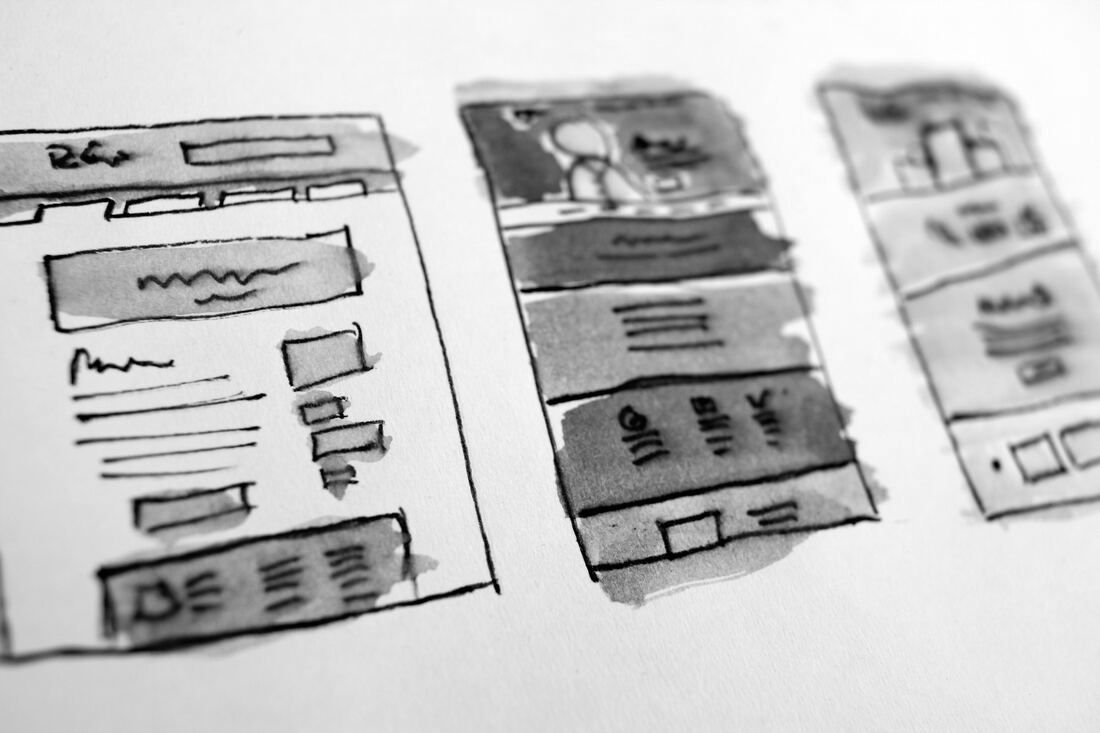
| Print & Digital Graphic Design
| Social Media & Content Marketing
| Website Design, Development & SEO
| Video Editing, Production & Filmography
| Branding & UIUX Design
t: 07460735737
e: hayley.creasey@haysden.com
What areas do we cover in Kent? Dover, Rochester, Whitstable, Sandwich, Canterbury, City of Canterbury, Herne Bay, Margate, Chatham, Tenterden, Maidstone, Tonbridge, Gravesend, Ramsgate, Royal Tunbridge Wells, Faversham, Broadstairs, Hythe, Ashford, New Romney, Sittingbourne, Wye, Aylesford, Goudhurst, Biddenden, Deal, Edenbridge, Dartford, Fordwich, Lydd, Chilham, Westerham, Sevenoaks, Sheerness, Dymchurch, Hever, Strood, Chiddingstone, Gillingham, Hawkhurst, Queenborough, Snodland, Elham, Reculver, Swanscombe, Walmer, Igtham, Penshurst. Plus all surrounding counties including Sussex and London.

We're happy to help all clients across the UK and beyond. Please get in touch today to discuss your next project.
Terms and conditions | Contract and Service Agreement | Privacy Policy
  • HOME
  • SERVICES
  • Our Work
  • CLIENTS
  • Packages & Pricing
  • Get in Touch
  • Blog